A monitoring and management platform for ATM networks where every second matters. My challenge: transform large volumes of technical data into an experience that enables operators to detect incidents, prioritize actions, and make decisions quickly.
Overview
ATMSec is a monitoring and management platform for ATM networks, where every second matters. My challenge was to transform large volumes of technical data into an experience that enables operators to detect incidents, prioritize actions, and make decisions quickly.
Rather than jumping straight into UI design, I started by understanding the operational context, business workflows, and users' real needs. The goal was to reduce cognitive load and turn complex data into actionable insights.
01 — Understanding the Problem
I analyzed how operators interacted with the platform, which information they accessed most frequently, and where the biggest friction points existed.
Key questions that guided discovery
What does an operator need to see first? · How can critical incidents be identified within seconds? · Which information truly supports decision-making?
This discovery phase helped establish the product priorities before designing any interface.
02 — Information Architecture
Based on the research findings, I organized the platform's information into a clear and scalable architecture. The sidebar navigation was designed to minimize the time users spend searching for features, while the dashboard brings together only the metrics that require immediate attention.
Each section serves a specific operational purpose
Overall system health · ATM availability · Critical processes · Geographic distribution · Active incident management
Platform IA — navigation organized by operational purpose
03 — Wireframing
I explored multiple layout variations before arriving at the final solution. The objective was to create a visual hierarchy that allowed operators to understand the overall status of the operation in less than five seconds.
Every component was designed to minimize interactions and support continuous monitoring.
04 — Visual Design
The interface follows a clean, modern aesthetic inspired by enterprise monitoring platforms. Every visual decision was made to support operators during long shifts.
Visual decisions
Highlight critical information through meaningful color usage · Reduce visual noise · Maintain consistency across charts, tables, and maps · Improve readability during long operational shifts
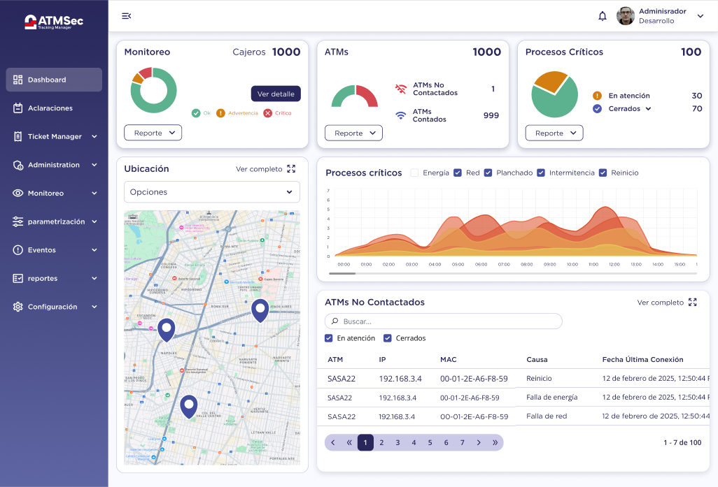
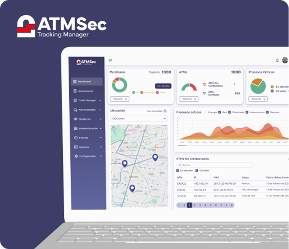
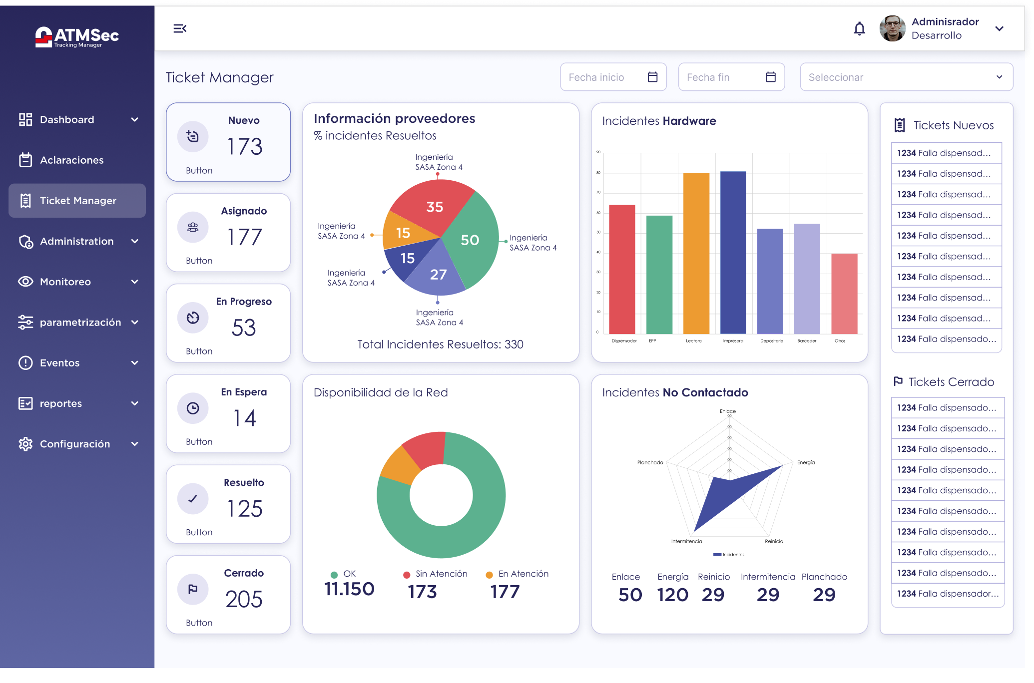
Overview dashboard — full fidelity
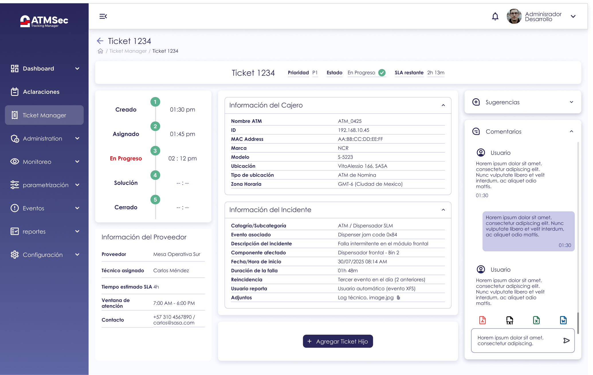
Active incident list — sortable, filterable
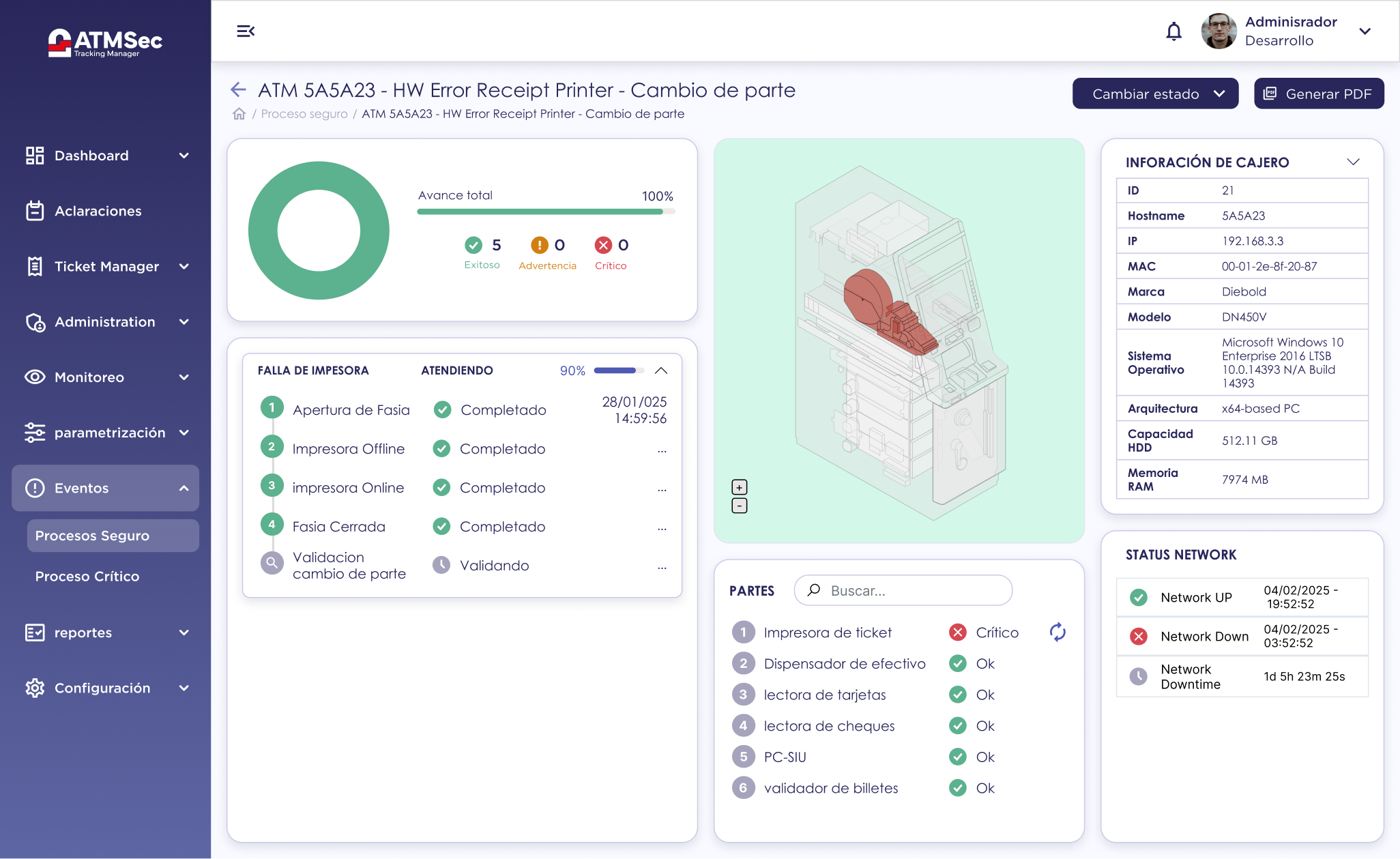
ATM distribution — color-coded by status
05 — Design System
To ensure scalability, I built a reusable design system based on modular components. This approach maintained consistency and enables future features to be added efficiently while preserving a cohesive user experience.
Components covered
Cards · Tables · Charts · Forms · States · Buttons · Navigation · Spacing · Typography
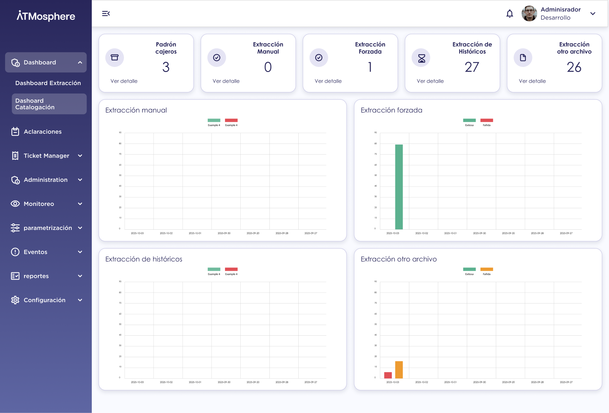
Full component library — all states documented
06 — Final Outcome
The final product is a dashboard that enables operators to quickly identify critical incidents, monitor hundreds of ATMs, and manage operations from a single, unified interface.
Rather than simply designing an interface, my goal was to create a tool that supports faster and more confident decision-making in an environment where speed and accuracy are essential.
60%
Reduction in time-to-triage in usability tests
0
Critical alerts missed in 2-week pilot period
4.8
Operator satisfaction score (out of 5)
Reflection
Design principle
Great design isn't about displaying more information — it's about presenting the right information at the right time. Every UX decision was driven by the goal of reducing user effort, improving operational efficiency, and building a scalable product capable of evolving alongside the business.